Durable helped Ford Foundation become the standard of excellence for how large philanthropies articulate their mission in digital channels.
Business case
Under the new leadership of Darren Walker, the Ford Foundation sharpened its focus on global inequality. A reimagined content strategy was required to communicate this strategic shift and related changes to the foundation’s program areas. The content strategy also needed to advance the foundation’s long-term goals for transparency and thought leadership.
In addition to signaling a strategic evolution, it was essential to reflect the cultural shift taking place at the foundation. Walker’s vision for the Ford Foundation rejected the bureaucratic approach common in the philanthropic world, pushing the foundation to flourish as a vibrant, nimble organization. To convey this sense of dynamism, the IA and UX were reevaluated.
Our solutions
Working closely with the Ford Foundation Office of Communications, we helped define a new content strategy and a redesigned IA and UX. The new site is built on Umbraco, hosted on Azure and integrated with Workday, MS Dynamics, and Ford’s grants management database.
Energetic and timely
- The home screen was reimagined to demonstrate that Ford is a vibrant, innovative organization and highlight the foundation’s most recent activities.
- Filterable cards represent a wide range of content, ranging from tweets to press releases, blog posts to events.

Transparent
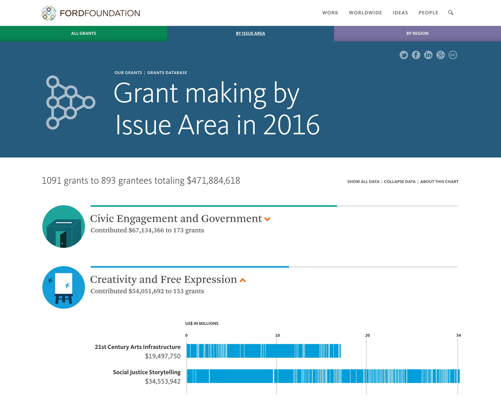
- The grants database was redesigned to increase transparency and help visitors better understand the foundation’s grantmaking strategies.
- Map- and chart-based infographics are an essential aspect of the UX to help visitors visualize the data.
- An alternative “standard taxonomy” was introduced to accommodate grantmaking paradigms going back ten years.

People-focused
- The new site brings the grantmaking staff into the foreground, unlike typical foundation websites.
- Grantmakers can be filtered by title, region and program area.

Open dialogue
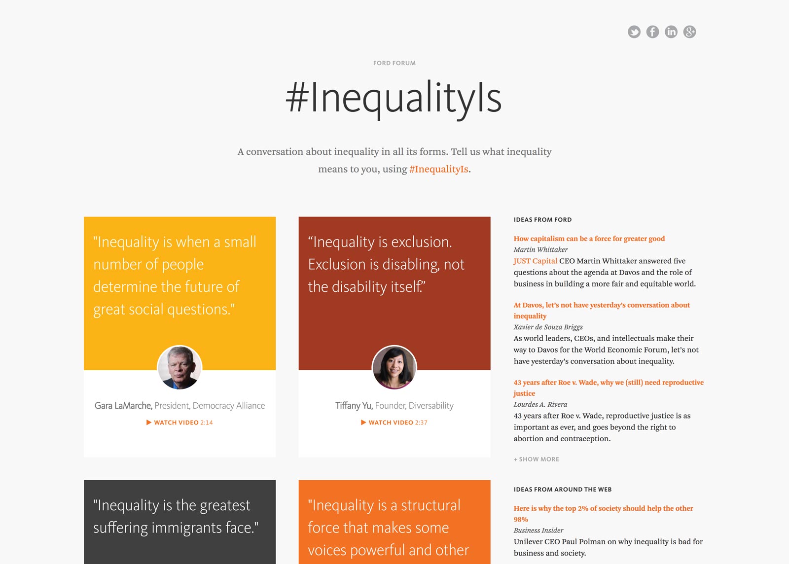
- Presented as a conversation about inequality in all its forms, the #InequalityIs section highlights the foundation’s sharpened focus on global inequality.
- 38 videos are presented from people of all walks of life—celebrities, blue-collar workers, CEOs, academics, etc.—each discussing what inequality means to them.
Results
A qualitative research study commissioned shortly after launch confirmed we met the critical content strategy goals for the website.
“...really cool for Ford, not what you would expect.”
“...visually friendly, it paints a picture and then gives you the narration you need in order to navigate.”
“The way it feels really open says something good culturally.”


